Today we are launching a new branding concept, which has been underway for quite some time now. Since we’ve had our new logo go-live we have had a very simple black and white brand logo display ad running across the google display universe.
Of course we wanted to update this with new colours, more compelling design and a more informational textual impression.
So, this is what the old google display ad campaigns were looking like. Boring right? Yeah, our logo was there – but what does that say? Its not that we are Apple, Nike og Coco-Cola and the market and people within does actually know it and what we do. Hence we needed something different and more sophisticated.

Instead. This is what we came up with…


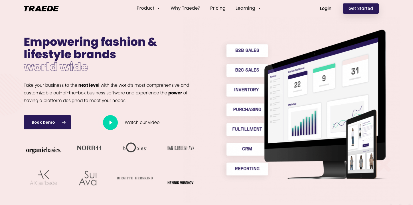
Looks like something you have seen before? Yeah right? Now, there is a much better synergy between display ads running and the universe you will enter once clicking the ads.
We hope you will enjoy our new display ads and now find them too disturbing when browsing around the internet.
Have a lovely browse.